iRewards - UI/UX
NTU Entrepreneurship Project. It's called 卡伯 in Taiwan

Duration - 3 months
My Role - UI/UX Designer
My Team - 2 developers, 1 UX researcher, 1 PR
卡伯(Cardbo)
Our Team
Tech Stack
Design - Adobe XD, Adobe Illustrator, Adobe Photoshop
Problem
In Taiwan, people love using credit cards. One may have 6-15 credit cards because each has a different reward policy. For those users, it may be a headache to them when choosing which credit card to pay for stuff. So our product aims to solve this problem.

ProblemsUser Research
To better find users' pain points, we collected quantitative data from 264 people using SurveyCake, and interviewed 15 people online to gather qualitative data. Here are some key findings.

User ResearchPersona
Based on the users' data we collected, there are two types of users. The Petty Bourgeoisie and the Credit Card Enthusiast. We created personas for them to better understand their lifestyles and behavior patterns.

PersonaIdeation
This is my own part of ideation.

HMWs
Wireframe
I prefer creating wireframes directly in photoshop using my drawing tablet because drawing gives me more freedom than pulling boxes inside Figma.

Wireframe
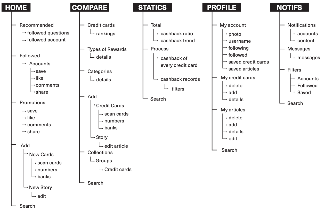
Information Architecture
Based on the refined version of wireframes, I built the information architecture. Information architecture is a very good way to connect with developers because it shows the whole structure of the application, so developers can start arranging some basic components and logic.

Information ArchitectureUI Specs
Here is my favorite design part.

UI SpecPrototype
Give it a try!

PrototypeUsability Test
I invited 3 tester to test this app. Here are the results.

Usability TestTakeaways
- Don’t ask questions continuously during user interviews
- Give users some thing to try or play with
- Turn WHY questions into WHAT questions